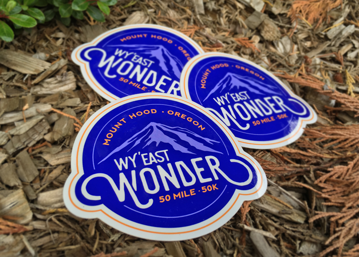
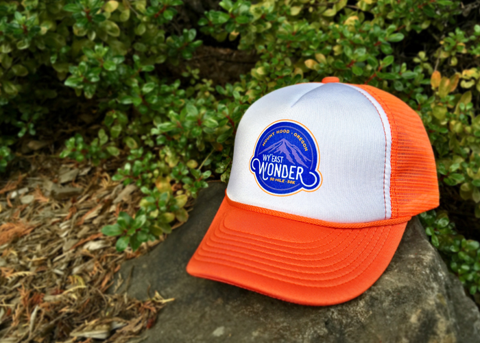
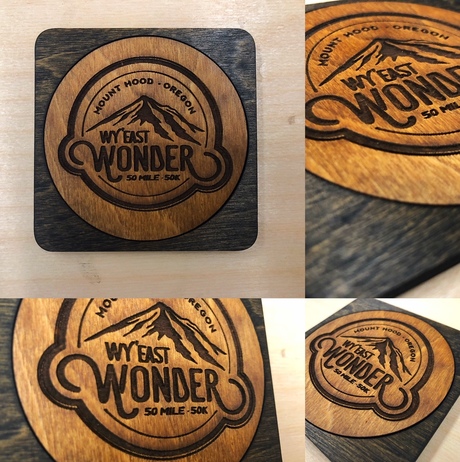
Go Beyond Racing produces challenging, top-notch races in the PNW, specializing in trail races and ultras in rugged and beautiful locales. They needed a logo for their new race, Wy’east Wonder 50 Mile & 50k, which traverses the eastern ridges of Mount Hood, Oregon.
The Goals
With so many races saturating the running scene now, the goals of the project were to:
1) Design a logo with character that would stand out from other races – both locally* and regionally
2) Create a unique and compelling brand for the race
3) Design a logo that would be memorable and encourage registration and merchandise sales
4) Showcase Mount Hood – which is the main draw of the race
5) Work well with their existing portfolio of race brands, maintaining Go Beyond’s professional race feel
*Specifically another race run on the exact same course and named very similarly – “Wy’east Howl”![]() The Solution
The Solution
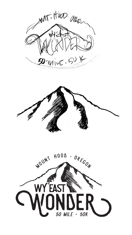
– I focused on a visual representation of Mt. Hood and a way to typographically emphasize the “Wonder” part of the race’s name (since a competitor race also had “Wy’east” in their name). Those two driving forces anchored the concept – an iconic mountain and “Wonder”.
– Stylistically, I worked to give the logo a handcrafted feel to reflect the ruggedness of the trails the race would be run on. The hand drawn mountain artwork and rough-hewn type support this effort.
– In order to further set their race apart from competitors, I came up with a color palette that no other race was using: purple and orange. The lyrics from “America the Beautiful”: …For purple mountain majesties… also came to mind when thinking about the iconic Mt. Hood. And orange brought some energy to the palette, helping the palette stay masculine and not skew overly feminine with the lavender.
– A self-contained version as well as a free-form version of the logo was produced to give Go Beyond Racing maximum flexibility for their marketing efforts and race production.
The Process – Sketches to Refinement
![]()