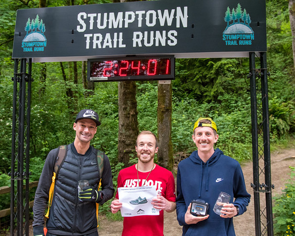
Go Beyond Racing produces challenging, top-notch races in the PNW, specializing in trail races and ultras in rugged and beautiful locales. They were renaming and rebranding a set of well-loved local races (Trail Factor 50k and Half Marathon) to be called Stumptown Trail Runs. The only requirement was to incorporate a “stump” and the new name.
The Goal
With so many races saturating the running scene now, I wanted the new identity to be a truly unique and fresh representation of trail running in Stumptown (Portland, OR), paying homage to stumps, trees and trail. These goals included:
1) Represent the love locals have for our towering iconic trees and Forest Park – the race venue
2) Design a logo that would stand out from other races – both locally and regionally
3) Create a unique and compelling brand for the race
4) Design a logo that would be memorable and encourage registration and merchandise sales
The Solution
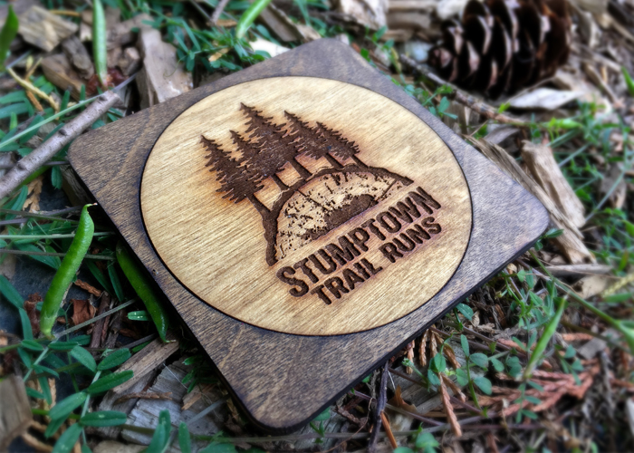
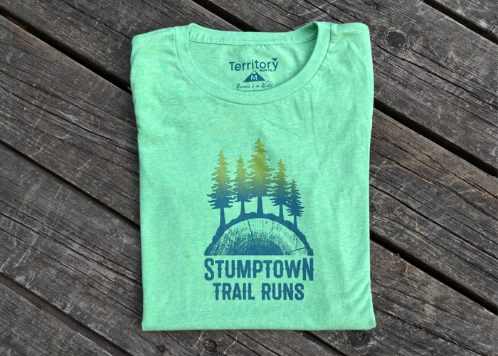
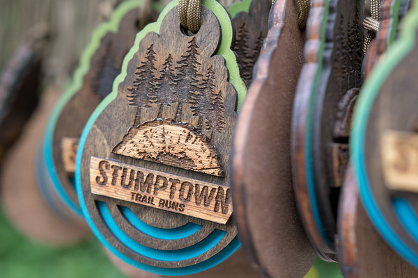
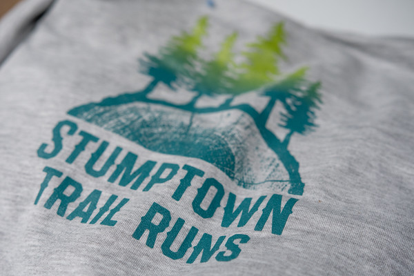
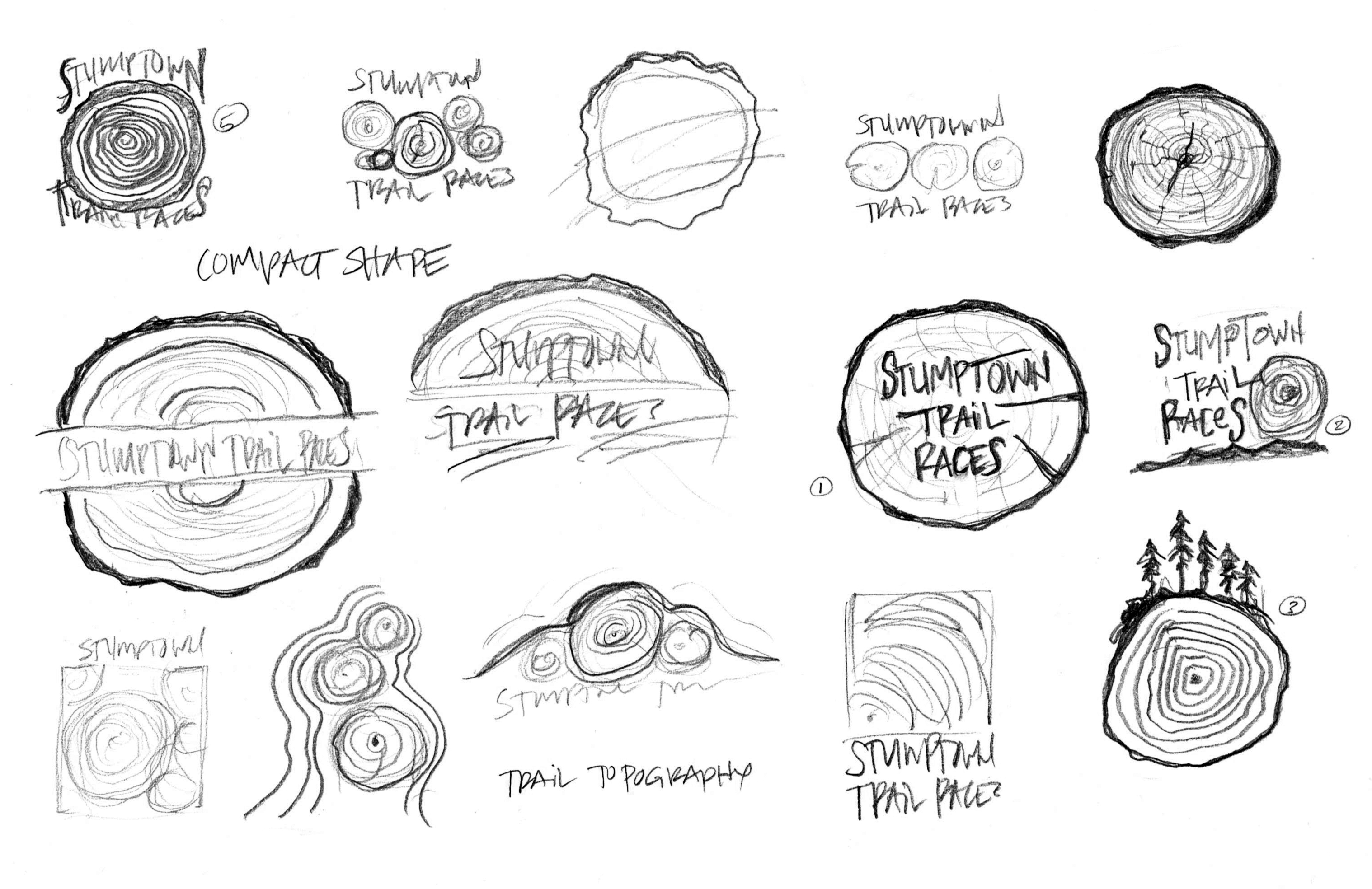
– Imagery: I was obsessed with tree stumps – doing extensive research, picture-taking and sketching of various stumps and tree ring patterns. The rough bumpy outer bark on a cross section of a tree reminded me of the rolling terrain of forest trails… it just needed trees growing out of it. That became the concept that was ultimately developed. The photorealistic cross-cut texture was also an important part in achieving the unique flavor of the logo.
– Typography: I wanted to characterize the new ‘Stumptown’ brand a bit western with a modern touch of hipster. The race name also needed to stand up to the detail of the rest of the imagery.
– Color palette: convention would have you use shades of green and brown – the normal colors of trees and stumps. But I really felt an unexpected color combination of muted blue-green gradating up to a vibrant spring green would really set the logo apart. The gradation adds energy and life to the logo.