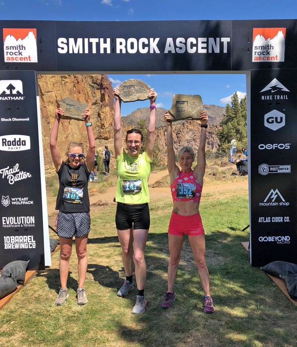
Go Beyond Racing produces challenging, top-notch races in the PNW, specializing in trail races and ultras in rugged and beautiful locales, in this case, Oregon’s high desert Smith Rock State Park.
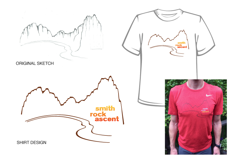
They wanted to rebrand their collection of Central Oregon races and update their image with a set of completely new logos, based on the t-shirt artwork I’d done the previous year, which featured the iconic rock formations as simple linework.
The Goals
1) Showcase the iconic Smith Rock landscape – the high desert location for all of the races
2) Design logos that would have character and stand out from other races – both locally and regionally
3) Create a strong and compelling brand for their races, both trail and road
4) Design logos that would be memorable and encourage registration and merchandise sales
The Solution
– Simplicity. The client really liked the linework from the t-shirt design, so I wanted to incorporate that and craft a compact and cohesive identity based on that artwork.
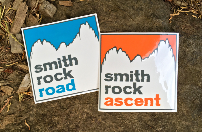
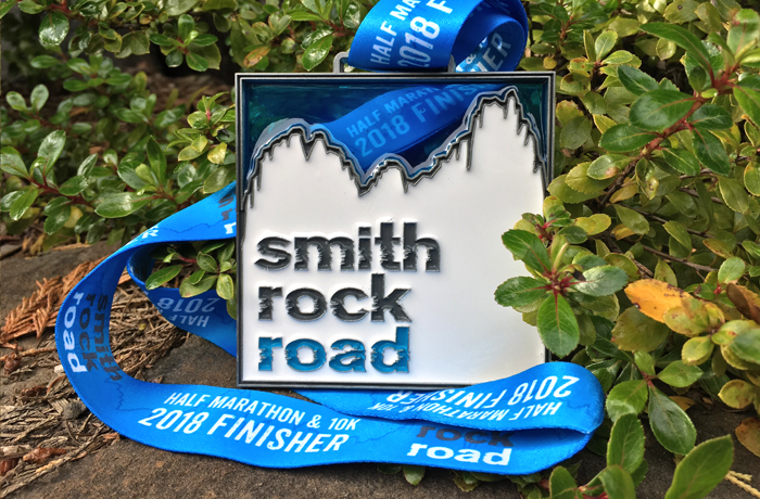
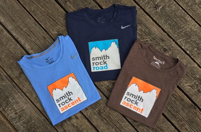
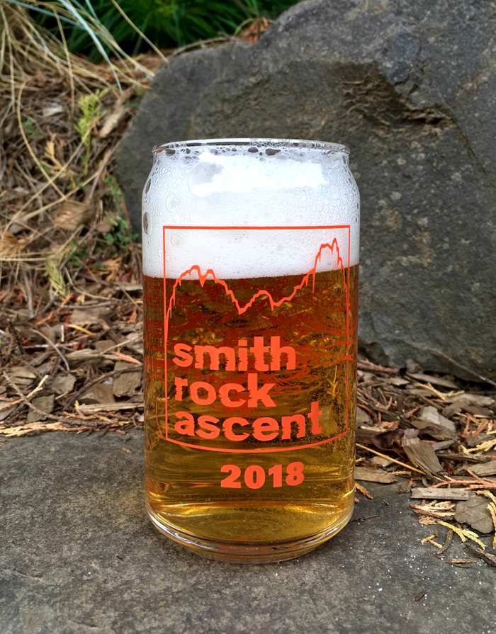
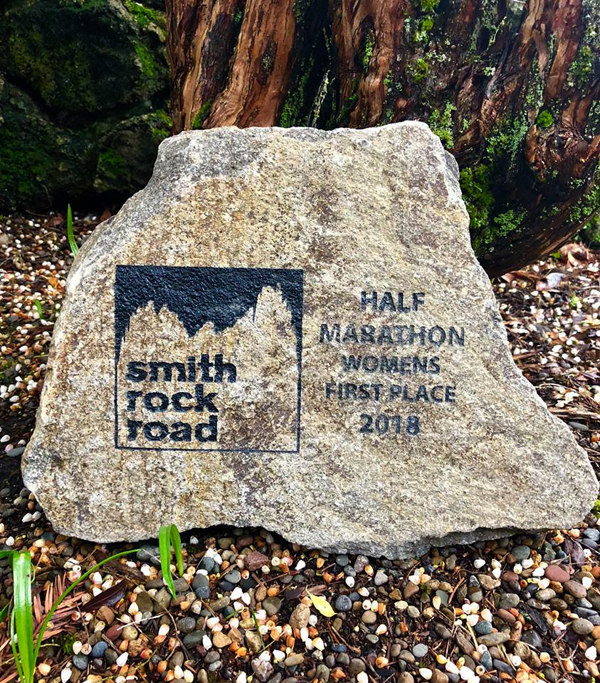
– I focused on the landscape – with its rock spires and sheer cliffs surrounding the Crooked River – reworking the simple though highly recognizable linedrawing. The design was distilled down to detailed linework, negative space, color-blocking and a typeface that evoked the roughness of the rock.
– A vibrant color palette that worked together for both the trail and road events. A palette of warm cayenne orange for “trail” logo and complementary bluebird sky blue for “road” logo, combined with a neutral granite grey was chosen.
Words from the Client
“Karen, this is stellar! You did a great job of making it simple and strong and compelling. THANK YOU!”
– Renee Seker Janssen, Co-Owner of Go Beyond Racing