The Goal
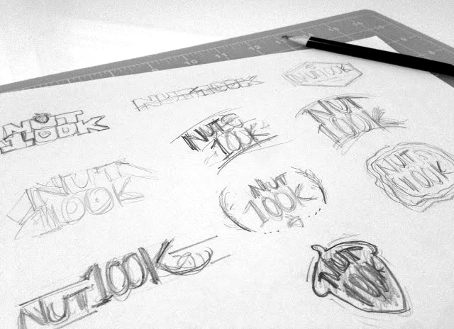
Go Beyond Racing contacted me to design the logo for their brand new event: the NUT 100K, a 64-mile ultramarathon to be run on the gorgeous North Umpqua Trail in Oregon. The type-driven logo needed to be bold & rugged and include a “nut” of some sort.
The Solution
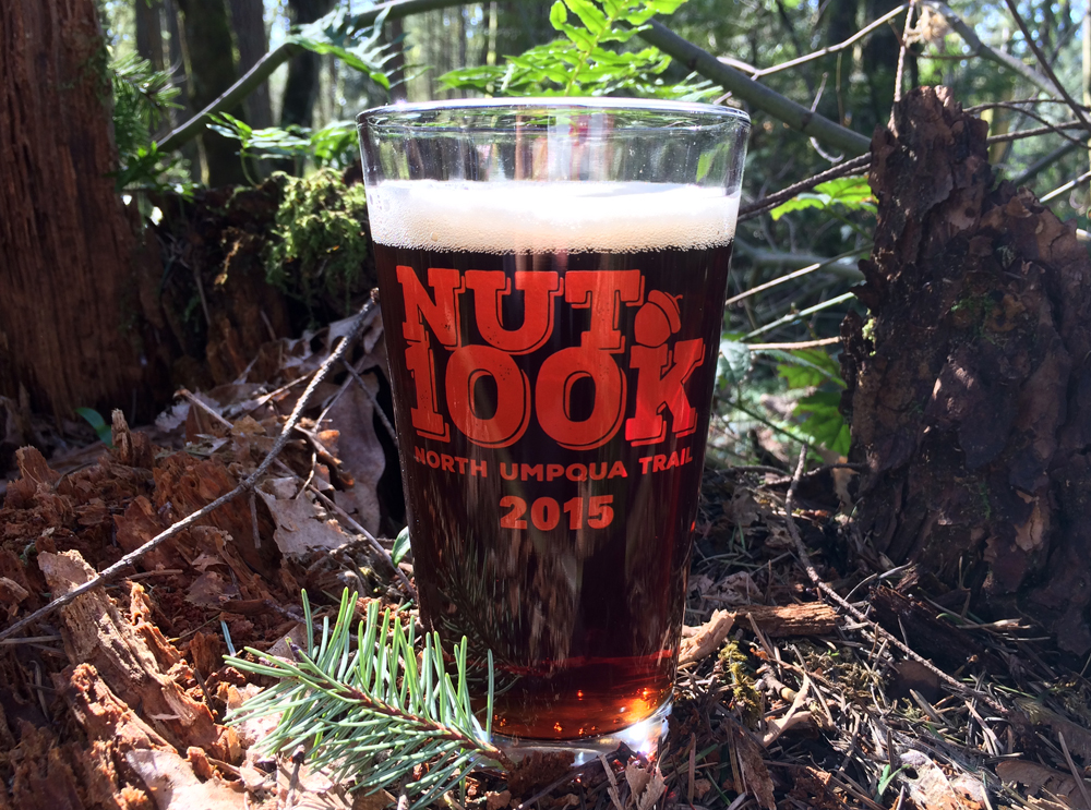
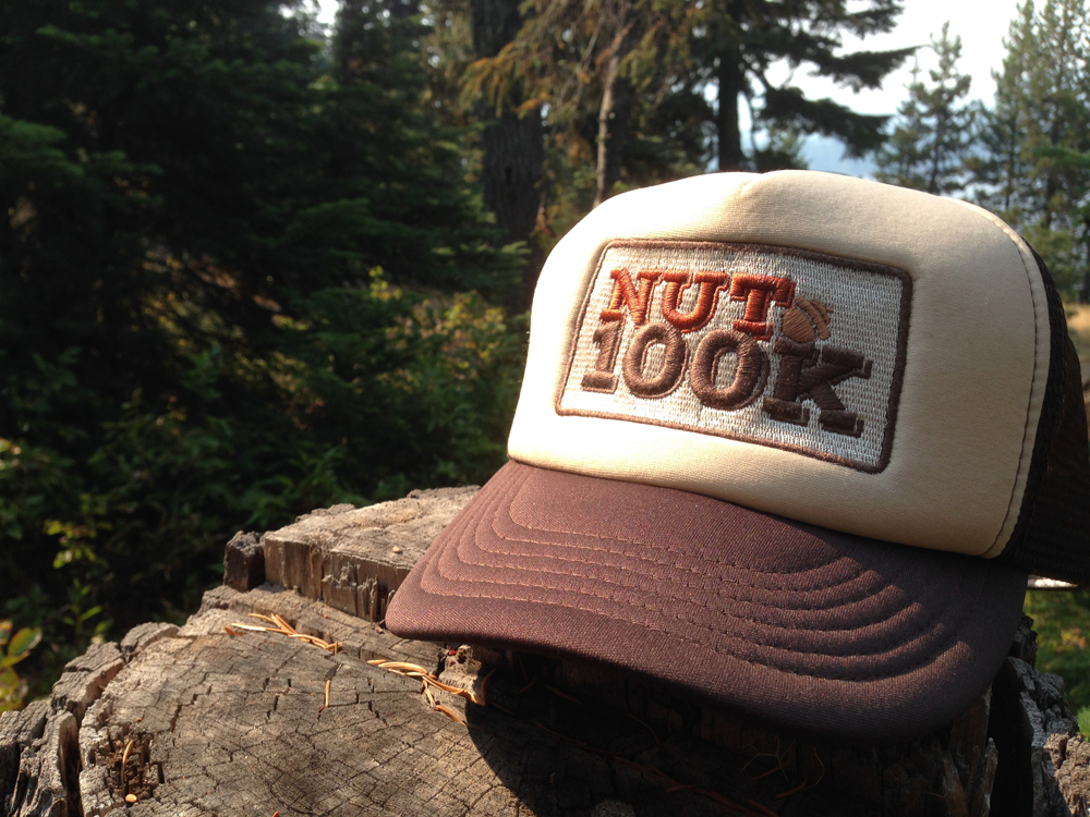
Wanting to create an audacious and adventurous identity worthy of the distance (that would look great on a trucker hat, IMHO), I worked with a distressed slab serif font to convey the burly nature of this race, drew an acorn “nut” icon, and crafted them in an earthy palette of dark chocolate, chestnut, and rusty orange.
Multiple formats were provided for various applications, including marketing, online and social media channels, race signage, apparel, stickers, pint glasses… and a trucker hat.
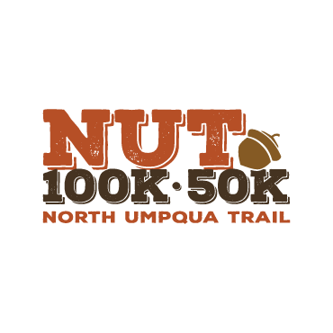
![]() For the 2016 edition of the “NUT”, a new 50k distance was offered – so the logo was reworked to include the new 50k distance, while maintaining the integrity of the original logo.
For the 2016 edition of the “NUT”, a new 50k distance was offered – so the logo was reworked to include the new 50k distance, while maintaining the integrity of the original logo.